

A New SEO Ranking Factor Is Born
As a business owner who wants to boost SEO rankings and website traffic from Google, there’s a new ranking signal in town that, if ignored, could have your website making a disappearing act from the first page costing you not only traffic but revenue.


Want the heads up when we share new strategies? Subscribe Here
Google’s recent announcement confirms that mobile-friendliness is now a ranking factor for websites in search results.
On November 18, 2014, Google posted that their goal is to “make it easier for people to find the information that they’re looking for” and that they were adding a “mobile-friendly” label to mobile search results.
On February 26, 2015, Google announced that starting in April, they'd be expanding on looking at whether a website is mobile friendly and using that as a ranking signal.
Does This Bother You?
I don’t know about you but I have a busy life and when I’m on my smartphone, selfishly, I want things now.
It’s one thing if a site doesn’t load fast, like in 2.3 seconds or less. But that's for another post.
Once it does load, if I have to pinch and squeeze to see the page, it’s like telling me you don’t like one of my kids and meaning it :).
Sorry, but I’m out of there.
Does this bother you too?
I know it's crazy, but I don’t have the time to, as your potential customer who is visiting your website to deal with this inconvenience. I didn't mind a few years ago. But today's customers do.
Are You Even In The Game?
It may seem frustrating trying to keep up with all of Google’s changes, but they’re pretty open about their mission and the things they focus on.
First and foremost, they focus on their users, not our desires to improve SEO on our websites.
The mobile culture we now live in will continue to evolve so we too, must evolve.
What does this mean?
It means that if Google now deems that it’s no longer a good user experience for their users to be frustrated by text being too small or links on the page that you just can’t find, then it makes sense that our potential customers might feel the same.
SCORE reported in December 2014 that just 51% of small businesses have websites. These firms don't even have a seat at the table of digital commerce which is a shame.
Of the small businesses that do have a website, 93.3% are not mobile compatible despite 4 out of 5 consumers using a smartphone to shop.
This seems unbelievable, but there is hope for these businesses without a mobile website.
MOBILE-FRIENDLY BEST PRACTICES
There are some best practices you should follow to make sure that your website is in line with this new ranking factor.
1. Stay updated with what’s going on with Google’s changes.
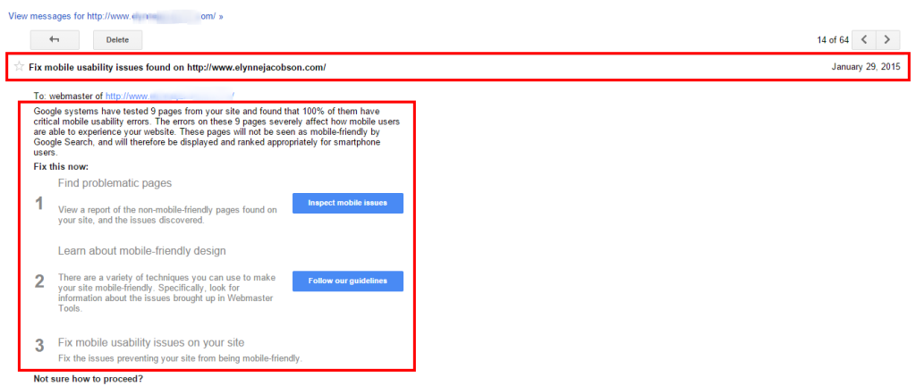
Everyone who has a website should be set up in Google Webmaster Tools. Google can let you know when the Googlebot crawls your site and sees something that it doesn't like about your site.
If you’re already set up, check for a message that look like this one below notifying you that your site may not be mobile-friendly.
Set up Google Webmaster Tools: https://www.google.com/webmasters/tools/
2. Check your website and all its pages with the Mobile-Friendly Test.
Google created a tool that allows you to check your site. Once on this page, enter your URL and click analyze. Within a 30 seconds or so, you’ll get your analysis and know right away if there are any issues you need to take care of.
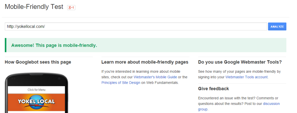
Test your site here: https://www.google.com/webmasters/tools/mobile-friendly/
3. Read the Webmaster’s Mobile guide.
This guide is another resource that Google has made available to webmasters that can help you address the mobile experience on your site.
Read the guide here: https://developers.google.com/webmasters/mobile-sites/
Geek alert: If you’re like me, you may need a web developer or designer to work with you on this because it’s in tech talk and I speak English.
CONCLUSION
The key here is to stay informed. If you’re like most business owners, you don’t want to deal with this stuff. You just want your website to show up in search rankings on Google so you can focus on delivering your product or service to the marketplace.
Unfortunately, if we want Google to send us customers, we have to pay attention to what they focus on. It’s really in your best interest in the long run since; I’m sure you’ll agree that you when you need an answer to a question, most often you "Google it."
Depending on what studies you read, mobile app and smartphone usage overtook PC web usage sometime in 2014. That trend may not mirror your website visitor traffic today, but there’s no doubt that it soon will.
If you think mobile first, your SEO future will brighter than the contrary.
Question: Is your website mobile-friendly? If so, is it a responsive design or are you using a separate mobile site? Share your answers below in the Google+ comments section or share with us on Facebook, Twitter or LinkedIn.


