If you’ve landed on this blog post, there’s a chance you’re either struggling with creating a calls-to-action that converts, i.e., no one’s clicking on them. Or maybe you keep hearing about about calls-to-action and want to know more about what they are and how to incorporate them into your marketing strategy.
Want to get more leads from your website?

In your research, you may have come across several blog posts that have told you how to design, tweak and optimize your CTAs. Well, we’re not only going to show you how to create calls-to-action, but CTAs that will assist in converting your visitors into leads.
Before diving into how to create the perfect call-to-action, you need to understand a few things.
What is a Call-to-Action in Marketing?
In marketing, a call-to-action, also referred to as a CTA, is a button or link that encourages visitors, leads, and customers to take action on your website.
These CTAs can be hard, i.e., download now, or soft, i.e., follow us on social media.
What You Need to Understand About CTAs
The purpose of a CTA is to drive your visitors through the buying journey towards your goal conversion. You can achieve this by making sure your calls-to-action need to be relevant to where your visitors are in their online shopping journey.
There are 3 categories of CTAs that coincide with the buyer's journey.
- TOFu (Top-of-Funnel) CTAs
At the top of the funnel, your CTAs should focus on pains and problems your persona is facing. All content tied to your TOFU CTA should always be educational; you want to help your audience not sell them anything or promote your company directly. These CTAs should be attached to offers such as Guides and "How-To's". - MOFu (Middle-of-Funnel) CTAs
Middle of the funnel CTAs is where you get to promote your brand and business by showcasing users what you or your product has done for others. These types of CTAs should lead to a case study, whitepaper, or webinar. - BOFu (Bottom-of-Funnel) CTAs
A bottom of the funnel CTA is useful for when someone is ready to see what you can do for them, how you can be the solution to their problem. These CTAs should be along the lines of “Schedule a Free Consultation,” or “Work with Us.”
How Long Should A Call to Action Be?
The length of your calls-to-action will vary based on the type of CTA (which we discuss below) you are using. A CTA can be a single or two to three world (perfect for buttons) or a full sentence (perfect for anchor texted CTAs). No matter the length of your CTA, make sure they’re relevant, encourage your visitors to take action, and get straight to the point.
As show you CTA examples below, you’ll see examples of CTAs of various lengths.
The 5 Types of CTAs (with 10 Examples That Generate Leads)
There are four common types of CTAs that are often used on websites:
- The CTA Button
CTA buttons aren’t text, a link, an image, or anything along the lines. They are buttons with a defined shape (rectangular or pill-shaped), actionable text, and contrasting color.
Here's an example from Drip; they use contrasting colors to make their primary call-to-action button standout against their white site paired with language that encourages users to take action.
- Anchor Text
Anchor text CTAs are text-based and link to a landing page. They are generally placed after the first paragraph of a blog post and styled in a way that stands out from the rest of the blog text. - In-Line Text CTA
An in-line text call-to-action is actionable text within a sentence that links to another page on your website which your users can convert. It's pretty much an internal link. - Banner or Image-Based CTA
Image-based CTAs are banner-like images that link to a landing page. Generally located at the end of a blog post or in a sidebar, they are not only appealing to the eye but are relevant to the content being read and contain copy that directly connects with users.
The banner CTA tends to be the most complicated to implement because it requires some graphic design chops. Of course, everyone isn't a graphic designer. If you'd like to learn how to create such a CTA, sign up for Get More Customers Academy Free.
7 Elements of A Click-Worthy CTA for Lead Generation
When creating your CTA, there are several elements you should include to improve its click-worthiness:
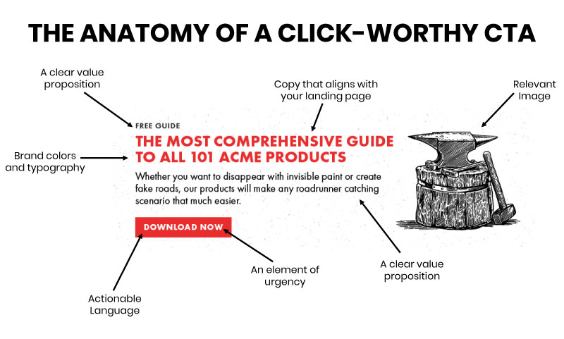
- Copy that aligns with your landing page: The text on your call to action, primarily your headlines in a banner or anchor text, should almost always align with the headline on your landing page. This confirms to users that they’re in the right place after clicking on your landing page.
Now when it comes to a button CTA, the language should tell your users what they’re going to get on the next page or what to do to get the offer, e.g. “Sign up for FREE,” or “Request a Demo” - A clear value proposition: Your value proposition is language that highlights the value you're offering. It can be as simple as using the word "Free," (for buttons or anchor text) or providing a short description of the benefits users will gain (for your banner CTAs) from your offer.
- Actionable language: Your CTAs should always contain verbs and actions words, such as "Download Now." Why? Your goal is to get your users to convert. You do this by telling them exactly what to do.
- An element of urgency: This is where FOMO (fear of missing out) comes to play. Make your users feel like they need whatever it is your offering, and they need now by using language such as “Now,” or “Today.”
- A pseudo-button: This is for your banner CTAs. You always want to incorporate an actionable button into the design so that your users know it's clickable.
- Relevant image: This mostly pertains to the banner CTA. If you’re offering an eBook, only use the cover of the eBook. If you're offering a service such as a free consultation or webinar, use the same image that you use on your landing page. You want to do this so your users can get a sense what they’re getting or being offered.
- Brand colors and typography: Your CTA should align with your brand identity, meaning you want to incorporate your brand colors and fonts into the CTA.
Where to Place CTAs on Your Website
Whether it’s your home page, landing page, blog post, or an email there are some basic CTA placement guidelines you should try to follow:
- Make your CTAs easy to find:
Never make your visitors search for a way to contact you, learn more, or obtain an educational piece of content that will assist them in finding a solution to their problem or pain. Your CTAs need to stick out and be easy to locate. - Place your call-to-action above the fold:
Your users should be able to see your CTA without having to scroll down the page. This primarily pertains to CTA buttons. For internal pages, such as blog posts or service pages can place your primary CTA in the sidebar, or implement the use of anchor text CTA after the first paragraph.
As you play around with CTA placement, based on your data, you’ll eventually determine the best spot on your website and within specific pages for them.
Call-to-Action A/B Testing
When’s the last time you updated a CTA on your website? Are you guilty of changing a CTA and aren’t sure how well it’s performing compared to previous versions?
In case you don’t get where I’m going, you should always test your CTAs using A/B testing. There are five main variables you can test to improve and upgrade your CTAs:
- Size and Shape: Do bigger CTAs convert better than small CTAs? Now you don’t want a CTA to be so small that’s its easily missed. On the other hand, you don’t want it to be so big to the point that it turns your visitors off. Play around with the size of your CTAs as well as the shape (rectangle vs pill).
- Styling: When testing the styling of your CTAs, consider the following, are your CTAs with images converting better than those without.
- Color: You may have heard that some colors convert better than others. Sure different colors evoke different emotions, but there’s no real science to selecting CTA color. However, we do recommend choosing a call-to-action color that contrasts with your website. For example, if your website is blue, black, and white make your CTAs yellow. Then you can test on your own, after testing several other factors, if a specific CTA color has an impact on clicks.
- Position: Does the position of your call-to-action have an impact on clicks, i.e. is it hard to find our miss. Does it receive more clicks when placed in the center of your header image at the top of a page vs in your navigation?
- Language: Does your CTA language resonate with your offer and your audience? Every word in your CTA needs to count.
When testing call-to-action variables, it’s best practice to test one variable at a time. It’s like a science project, you want to have a control to test against. This way you can better gauge what works and what doesn't.
Once you collect a significant amount of data you can better gauge which version of your calls-to-action perform best.
Calls-to-Action Are Only Half of the Equation
Now if it’s your goal to generate leads, educate your prospects, and acquire new clients, calls-to-action are a most. However, CTAs are only one part of the equation when trying to generate leads from your website. The second is your landing page, which is another beast in itself.
We won’t cover landing page in this post, but we recommend you take a look at 4 Reasons Your Landing Page Isn’t Converting Leads as well as our guide on eliminating conversion killers on your website.