You’re investing a lot of time and effort to market your business online. You're finally getting results and getting traffic landing on your website. But there is a problem. That traffic coming into your site is not converting into leads or purchases.

Here are seven methods to reduce the friction between your website and visitors.
1. Check Your Website’s Page Speed
First impressions are important. It takes a second for someone to form a judgment about a person. It is no different for your website.
Slow websites will kill your business. A slow site will irritate your visitor making their first initial thought about your business negative. Depending on the severity of page speed a visitor might leave the website entirely to find one that is quicker.
You can evaluate your page speed with Google's PageSpeed Insights.
A possible reason your page speed could be slow is unoptimized images. If your website contains many unoptimized images, it will slow down your page speed. Poorly optimized images are the most common reason behind slow pages. High-resolution photos can consume lots of bandwidth and increase load times on your page.
2. Improve Your Website's Readability
Your website needs to be easy to read! You do not want your website visitors to struggle to understand your services or products because your website is hard to read. There is a lot to consider when it comes to the readability of your sites like font choices, font sizes, colors, spacing, appropriate reading level, and quantity of text. Here are a few tips to keep in mind:
- Use words that your users understand. Keep your content around a 7th-8th-grade reading level.
- Be quick and make your point. Your homepage shouldn’t flood your visitors with so much text.
- Keep your font choices simple! Don’t use decorative fonts for paragraphs of text.

3. Implement Popups
Popups increase conversion rates and lead to more email captures. There are many types of popups you can utilize for your website. If used poorly you can create an irritating experience for your visitors. The goal is not to overwhelm, them but rather entice them with a great offer.
Here are a few examples of popups and how to use them.
- Entry Popups are dangerous but when used appropriately utilized are amazing. Funnel your traffic directly to a special promotion or a targeted landing page.
- Exit Popups track when your visitor is going to leave the website. The popup is your last-ditch effort to pull your visitor back to your site. You can ask them to subscribe to your blog or provide them with a deal they can not resist.
- Timed Popups appear after a short time. These popups provide your visitors to digest the content on your homepage before you give them an offer.
4. Create a Sense of Urgency
You want to reduce the hesitation your visitors have. Anytime a visitor thinks "maybe later" or "another time" you're risking them leaving your website to find a competitor's product or service.
You want your potential clients to take action immediately! You need to create a sense of urgency. A feeling that if they don't act now, they will miss an unbelievable opportunity.
Here are some tips for creating urgency in your Calls To Action' and on your website:
- Use keywords that indicate that this offer is not going to last long. (Limited Time, Act now, Short Period, Exclusive)
- Include a date or even a timer. Let them know exactly how long they need to act before it's gone.
- Offer a limited amount of stock, seats, and requests.
- Reward them for acting fast. (first ten people to purchase receive...)
Related: How to Create Irresistible Calls-to-Action for Your Website
5. Create Better Forms
Another conversion killer is the presence of an overly complicated form. Your goal is to get your visitors to convert. Having an unnecessary wall between you and your potential client is silly. Here are some tips to improve your forms for higher conversion rates.
- Ask as little as possible. Only ask questions that are relevant and necessary for you to move forward. In this case, less is more.
- Pre-fill/auto-detect as much as you can. Choose questions that can easily be auto-filled by Google or your systems.
- Use labels in conjunction with placeholders. Both help visitors understand each section.
- Keep your forms one column. Multiple columns mess with flow and cause users to lose track of their placement.
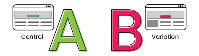
6. Start A/B Testing
A/B testing or split testing is a marketing strategy of comparing two versions of a webpage to see which performs better. This strategy is essential to getting a better understanding of what on your homepage is working. These tests also provide you with actionable insights that you can utilize to create better content. Here are areas on your homepage you can split test.
- CTA and Headlines
- Images and header graphics
- Popups! Try different popups.
- Forms
You can begin A/B tests by using Google Analytics.
7. Use Heat Maps
A heat map on your website is vital to understanding what your visitors are doing once they arrive at your site. You can track where your visitors are clicking, scrolling, and reading. It gives you the insights you need to understand what is keeping your visitors from converting.
For example, maybe you notice people are not scrolling past a particular section of your homepage. You can make changes to that section to entice viewers to continue.
Related: How to Improve Customer Experience by Reducing Friction
There are many more techniques to implement to improve the performance of your homepage. Thankfully we created a free guide on eliminating conversion killers on your website.
Transform your digital presence with Yokel Local today! Discover tailored marketing strategies that drive real results. Contact Us Now and start growing your business online.